Scottsdale Print Shop ) Mesa Print Shop ) Tempe Print Shop ) Phoenix Print Shop ) DC Ranch Print Shop ) Chandler Print Shop ) Peoria Print Shop ) Fountain Hills Print Shop ) Sun City Print Shop ) Glendale Print Shop ) Paradise Valley Print Shop ) Goodyear Print Shop ) Queen Creek Print Shop ) Avondale Print Shop ) Desert Ridge Print Shop ) Apache Junction Print Shop ) North Scottsdale Print Shop ) Pinnacle Peak Print Shop ) Grayawk Print Shop ) Kierland Print Shop ) Windsong Print Shop ) Mcdowell Mountain Ranch Print Shop ) Gainey Ranch Print Shop ) McCormick Ranch Print Shop ) Deer Valley Print Shop ) Arcadia Print Shop ) Troon Print Shop ) Silverleaf Print Shop ) Cave Creek Print Shop ) Old Town Print Shop ) South Scottsdale Print Shop ) Ancala Print Shop ) Central Phoenix Print Shop ) Carefree Print Shop ) Toleson Print Shop ) Ironwood Village Print Shop ) WIndgate Ranch Print Shop ) Northsight Print Shop ) Shea Print Shop ) Tatum Ranch Print Shop ) Casa Grande Print Shop ) Gilbert Print Shop ) Suprise Print Shop ) Buckeye Print Shop ) Scottsdale Banner Printing ) Mesa Banner Printing ) Tempe Banner Printing ) Phoenix Banner Printing ) DC Ranch Banner Printing ) Chandler Banner Printing ) Peoria Banner Printing ) Fountain Hills Banner Printing ) Sun City Banner Printing ) Glendale Banner Printing ) Paradise Valley Banner Printing ) Goodyear Banner Printing ) Queen Creek Banner Printing ) Avondale Banner Printing ) Desert Ridge Banner Printing ) Apache Junction Banner Printing ) North Scottsdale Banner Printing ) Pinnacle Peak Banner Printing ) Grayawk Banner Printing ) Kierland Banner Printing ) Windsong Banner Printing ) Mcdowell Mountain Ranch Banner Printing ) Gainey Ranch Banner Printing ) McCormick Ranch Banner Printing ) Deer Valley Banner Printing ) Arcadia Banner Printing ) Troon Banner Printing ) Silverleaf Banner Printing ) Cave Creek Banner Printing ) Old Town Banner Printing ) South Scottsdale Banner Printing ) Ancala Banner Printing ) Central Phoenix Banner Printing ) Carefree Banner Printing ) Toleson Banner Printing ) Ironwood Village Banner Printing ) WIndgate Ranch Banner Printing ) Northsight Banner Printing ) Shea Banner Printing ) Tatum Ranch Banner Printing ) Casa Grande Banner Printing ) Gilbert Banner Printing ) Suprise Banner Printing ) Buckeye Banner Printing ) Scottsdale Book Binding ) Mesa Book Binding ) Tempe Book Binding ) Phoenix Book Binding ) DC Ranch Book Binding ) Chandler Book Binding ) Peoria Book Binding ) Fountain Hills Book Binding ) Sun City Book Binding ) Glendale Book Binding ) Paradise Valley Book Binding ) Goodyear Book Binding ) Queen Creek Book Binding ) Avondale Book Binding ) Desert Ridge Book Binding ) Apache Junction Book Binding ) North Scottsdale Book Binding ) Pinnacle Peak Book Binding ) Grayawk Book Binding ) Kierland Book Binding ) Windsong Book Binding ) Mcdowell Mountain Ranch Book Binding ) Gainey Ranch Book Binding ) McCormick Ranch Book Binding ) Deer Valley Book Binding ) Arcadia Book Binding ) Troon Book Binding ) Silverleaf Book Binding ) Cave Creek Book Binding ) Old Town Book Binding ) South Scottsdale Book Binding ) Ancala Book Binding ) Central Phoenix Book Binding ) Carefree Book Binding ) Toleson Book Binding ) Ironwood Village Book Binding ) WIndgate Ranch Book Binding ) Northsight Book Binding ) Shea Book Binding ) Tatum Ranch Book Binding ) Casa Grande Book Binding ) Gilbert Book Binding ) Suprise Book Binding ) Buckeye Book Binding ) Scottsdale Booklet Printing ) Mesa Booklet Printing ) Tempe Booklet Printing ) Phoenix Booklet Printing ) DC Ranch Booklet Printing ) Chandler Booklet Printing ) Peoria Booklet Printing ) Fountain Hills Booklet Printing ) Sun City Booklet Printing ) Glendale Booklet Printing ) Paradise Valley Booklet Printing ) Goodyear Booklet Printing ) Queen Creek Booklet Printing ) Avondale Booklet Printing ) Desert Ridge Booklet Printing ) Apache Junction Booklet Printing ) North Scottsdale Booklet Printing ) Pinnacle Peak Booklet Printing ) Grayawk Booklet Printing ) Kierland Booklet Printing ) Windsong Booklet Printing ) Mcdowell Mountain Ranch Booklet Printing ) Gainey Ranch Booklet Printing ) McCormick Ranch Booklet Printing ) Deer Valley Booklet Printing ) Arcadia Booklet Printing ) Troon Booklet Printing ) Silverleaf Booklet Printing ) Cave Creek Booklet Printing ) Old Town Booklet Printing ) South Scottsdale Booklet Printing ) Ancala Booklet Printing ) Central Phoenix Booklet Printing ) Carefree Booklet Printing ) Toleson Booklet Printing ) Ironwood Village Booklet Printing ) WIndgate Ranch Booklet Printing ) Northsight Booklet Printing ) Shea Booklet Printing ) Tatum Ranch Booklet Printing ) Casa Grande Booklet Printing ) Gilbert Booklet Printing ) Suprise Booklet Printing ) Buckeye Booklet Printing ) Scottsdale Brochure Printing ) Mesa Brochure Printing ) Tempe Brochure Printing ) Phoenix Brochure Printing ) DC Ranch Brochure Printing ) Chandler Brochure Printing ) Peoria Brochure Printing ) Fountain Hills Brochure Printing ) Sun City Brochure Printing ) Glendale Brochure Printing ) Paradise Valley Brochure Printing ) Goodyear Brochure Printing ) Queen Creek Brochure Printing ) Avondale Brochure Printing ) Desert Ridge Brochure Printing ) Apache Junction Brochure Printing ) North Scottsdale Brochure Printing ) Pinnacle Peak Brochure Printing ) Grayawk Brochure Printing ) Kierland Brochure Printing ) Windsong Brochure Printing ) Mcdowell Mountain Ranch Brochure Printing ) Gainey Ranch Brochure Printing ) McCormick Ranch Brochure Printing ) Deer Valley Brochure Printing ) Arcadia Brochure Printing ) Troon Brochure Printing ) Silverleaf Brochure Printing ) Cave Creek Brochure Printing ) Old Town Brochure Printing ) South Scottsdale Brochure Printing ) Ancala Brochure Printing ) Central Phoenix Brochure Printing ) Carefree Brochure Printing ) Toleson Brochure Printing ) Ironwood Village Brochure Printing ) WIndgate Ranch Brochure Printing ) Northsight Brochure Printing ) Shea Brochure Printing ) Tatum Ranch Brochure Printing ) Casa Grande Brochure Printing ) Gilbert Brochure Printing ) Suprise Brochure Printing ) Buckeye Brochure Printing ) Scottsdale Business Card Printing ) Mesa Business Card Printing ) Tempe Business Card Printing ) Phoenix Business Card Printing ) DC Ranch Business Card Printing ) Chandler Business Card Printing ) Peoria Business Card Printing ) Fountain Hills Business Card Printing ) Sun City Business Card Printing ) Glendale Business Card Printing ) Paradise Valley Business Card Printing ) Goodyear Business Card Printing ) Queen Creek Business Card Printing ) Avondale Business Card Printing ) Desert Ridge Business Card Printing ) Apache Junction Business Card Printing ) North Scottsdale Business Card Printing ) Pinnacle Peak Business Card Printing ) Grayawk Business Card Printing ) Kierland Business Card Printing ) Windsong Business Card Printing ) Mcdowell Mountain Ranch Business Card Printing ) Gainey Ranch Business Card Printing ) McCormick Ranch Business Card Printing ) Deer Valley Business Card Printing ) Arcadia Business Card Printing ) Troon Business Card Printing ) Silverleaf Business Card Printing ) Cave Creek Business Card Printing ) Old Town Business Card Printing ) South Scottsdale Business Card Printing ) Ancala Business Card Printing ) Central Phoenix Business Card Printing ) Carefree Business Card Printing ) Toleson Business Card Printing ) Ironwood Village Business Card Printing ) WIndgate Ranch Business Card Printing ) Northsight Business Card Printing ) Shea Business Card Printing ) Tatum Ranch Business Card Printing ) Casa Grande Business Card Printing ) Gilbert Business Card Printing ) Suprise Business Card Printing ) Buckeye Business Card Printing ) Scottsdale Catalog Printing ) Mesa Catalog Printing ) Tempe Catalog Printing ) Phoenix Catalog Printing ) DC Ranch Catalog Printing ) Chandler Catalog Printing ) Peoria Catalog Printing ) Fountain Hills Catalog Printing ) Sun City Catalog Printing ) Glendale Catalog Printing ) Paradise Valley Catalog Printing ) Goodyear Catalog Printing ) Queen Creek Catalog Printing ) Avondale Catalog Printing ) Desert Ridge Catalog Printing ) Apache Junction Catalog Printing ) North Scottsdale Catalog Printing ) Pinnacle Peak Catalog Printing ) Grayawk Catalog Printing ) Kierland Catalog Printing ) Windsong Catalog Printing ) Mcdowell Mountain Ranch Catalog Printing ) Gainey Ranch Catalog Printing ) McCormick Ranch Catalog Printing ) Deer Valley Catalog Printing ) Arcadia Catalog Printing ) Troon Catalog Printing ) Silverleaf Catalog Printing ) Cave Creek Catalog Printing ) Old Town Catalog Printing ) South Scottsdale Catalog Printing ) Ancala Catalog Printing ) Central Phoenix Catalog Printing ) Carefree Catalog Printing ) Toleson Catalog Printing ) Ironwood Village Catalog Printing ) WIndgate Ranch Catalog Printing ) Northsight Catalog Printing ) Shea Catalog Printing ) Tatum Ranch Catalog Printing ) Casa Grande Catalog Printing ) Gilbert Catalog Printing ) Suprise Catalog Printing ) Buckeye Catalog Printing ) Scottsdale Commercial Printing ) Mesa Commercial Printing ) Tempe Commercial Printing ) Phoenix Commercial Printing ) DC Ranch Commercial Printing ) Chandler Commercial Printing ) Peoria Commercial Printing ) Fountain Hills Commercial Printing ) Sun City Commercial Printing ) Glendale Commercial Printing ) Paradise Valley Commercial Printing ) Goodyear Commercial Printing ) Queen Creek Commercial Printing ) Avondale Commercial Printing ) Desert Ridge Commercial Printing ) Apache Junction Commercial Printing ) North Scottsdale Commercial Printing ) Pinnacle Peak Commercial Printing ) Grayawk Commercial Printing ) Kierland Commercial Printing ) Windsong Commercial Printing ) Mcdowell Mountain Ranch Commercial Printing ) Gainey Ranch Commercial Printing ) McCormick Ranch Commercial Printing ) Deer Valley Commercial Printing ) Arcadia Commercial Printing ) Troon Commercial Printing ) Silverleaf Commercial Printing ) Cave Creek Commercial Printing ) Old Town Commercial Printing ) South Scottsdale Commercial Printing ) Ancala Commercial Printing ) Central Phoenix Commercial Printing ) Carefree Commercial Printing ) Toleson Commercial Printing ) Ironwood Village Commercial Printing ) WIndgate Ranch Commercial Printing ) Northsight Commercial Printing ) Shea Commercial Printing ) Tatum Ranch Commercial Printing ) Casa Grande Commercial Printing ) Gilbert Commercial Printing ) Suprise Commercial Printing ) Buckeye Commercial Printing ) Scottsdale Coroplast Signs ) Mesa Coroplast Signs ) Tempe Coroplast Signs ) Phoenix Coroplast Signs ) Scottsdale Digital Printing ) Mesa Digital Printing ) Tempe Digital Printing ) Phoenix Digital Printing ) DC Ranch Digital Printing ) Chandler Digital Printing ) Peoria Digital Printing ) Fountain Hills Digital Printing ) Sun City Digital Printing ) Glendale Digital Printing ) Paradise Valley Digital Printing ) Goodyear Digital Printing ) Queen Creek Digital Printing ) Avondale Digital Printing ) Desert Ridge Digital Printing ) Apache Junction Digital Printing ) North Scottsdale Digital Printing ) Pinnacle Peak Digital Printing ) Grayawk Digital Printing ) Kierland Digital Printing ) Windsong Digital Printing ) Mcdowell Mountain Ranch Digital Printing ) Gainey Ranch Digital Printing ) McCormick Ranch Digital Printing ) Deer Valley Digital Printing ) Arcadia Digital Printing ) Troon Digital Printing ) Silverleaf Digital Printing ) Cave Creek Digital Printing ) Old Town Digital Printing ) South Scottsdale Digital Printing ) Ancala Digital Printing ) Central Phoenix Digital Printing ) Carefree Digital Printing ) Toleson Digital Printing ) Ironwood Village Digital Printing ) WIndgate Ranch Digital Printing ) Northsight Digital Printing ) Shea Digital Printing ) Tatum Ranch Digital Printing ) Casa Grande Digital Printing ) Gilbert Digital Printing ) Suprise Digital Printing ) Buckeye Digital Printing ) Scottsdale Direct Mailing Services ) Mesa Direct Mailing Services ) Tempe Direct Mailing Services ) Phoenix Direct Mailing Services ) DC Ranch Direct Mailing Services ) Chandler Direct Mailing Services ) Peoria Direct Mailing Services ) Fountain Hills Direct Mailing Services ) Sun City Direct Mailing Services ) Glendale Direct Mailing Services ) Paradise Valley Direct Mailing Services ) Goodyear Direct Mailing Services ) Queen Creek Direct Mailing Services ) Avondale Direct Mailing Services ) Desert Ridge Direct Mailing Services ) Apache Junction Direct Mailing Services ) North Scottsdale Direct Mailing Services ) Pinnacle Peak Direct Mailing Services ) Grayawk Direct Mailing Services ) Kierland Direct Mailing Services ) Windsong Direct Mailing Services ) Mcdowell Mountain Ranch Direct Mailing Services ) Gainey Ranch Direct Mailing Services ) McCormick Ranch Direct Mailing Services ) Deer Valley Direct Mailing Services ) Arcadia Direct Mailing Services ) Troon Direct Mailing Services ) Silverleaf Direct Mailing Services ) Cave Creek Direct Mailing Services ) Old Town Direct Mailing Services ) South Scottsdale Direct Mailing Services ) Ancala Direct Mailing Services ) Central Phoenix Direct Mailing Services ) Carefree Direct Mailing Services ) Toleson Direct Mailing Services ) Ironwood Village Direct Mailing Services ) WIndgate Ranch Direct Mailing Services ) Northsight Direct Mailing Services ) Shea Direct Mailing Services ) Tatum Ranch Direct Mailing Services ) Casa Grande Direct Mailing Services ) Gilbert Direct Mailing Services ) Suprise Direct Mailing Services ) Buckeye Direct Mailing Services ) Scottsdale Flyer Printing ) Mesa Flyer Printing ) Tempe Flyer Printing ) Phoenix Flyer Printing ) DC Ranch Flyer Printing ) Chandler Flyer Printing ) Peoria Flyer Printing ) Fountain Hills Flyer Printing ) Sun City Flyer Printing ) Glendale Flyer Printing ) Paradise Valley Flyer Printing ) Goodyear Flyer Printing ) Queen Creek Flyer Printing ) Avondale Flyer Printing ) Desert Ridge Flyer Printing ) Apache Junction Flyer Printing ) North Scottsdale Flyer Printing ) Pinnacle Peak Flyer Printing ) Grayawk Flyer Printing ) Kierland Flyer Printing ) Windsong Flyer Printing ) Mcdowell Mountain Ranch Flyer Printing ) Gainey Ranch Flyer Printing ) McCormick Ranch Flyer Printing ) Deer Valley Flyer Printing ) Arcadia Flyer Printing ) Troon Flyer Printing ) Silverleaf Flyer Printing ) Cave Creek Flyer Printing ) Old Town Flyer Printing ) South Scottsdale Flyer Printing ) Ancala Flyer Printing ) Central Phoenix Flyer Printing ) Carefree Flyer Printing ) Toleson Flyer Printing ) Ironwood Village Flyer Printing ) WIndgate Ranch Flyer Printing ) Northsight Flyer Printing ) Shea Flyer Printing ) Tatum Ranch Flyer Printing ) Casa Grande Flyer Printing ) Gilbert Flyer Printing ) Suprise Flyer Printing ) Buckeye Flyer Printing ) Scottsdale Graphic Design ) Mesa Graphic Design ) Tempe Graphic Design ) Phoenix Graphic Design ) DC Ranch Graphic Design ) Chandler Graphic Design ) Peoria Graphic Design ) Fountain Hills Graphic Design ) Sun City Graphic Design ) Glendale Graphic Design ) Paradise Valley Graphic Design ) Goodyear Graphic Design ) Queen Creek Graphic Design ) Avondale Graphic Design ) Desert Ridge Graphic Design ) Apache Junction Graphic Design ) North Scottsdale Graphic Design ) Pinnacle Peak Graphic Design ) Grayawk Graphic Design ) Kierland Graphic Design ) Windsong Graphic Design ) Mcdowell Mountain Ranch Graphic Design ) Gainey Ranch Graphic Design ) McCormick Ranch Graphic Design ) Deer Valley Graphic Design ) Arcadia Graphic Design ) Troon Graphic Design ) Silverleaf Graphic Design ) Cave Creek Graphic Design ) Old Town Graphic Design ) South Scottsdale Graphic Design ) Ancala Graphic Design ) Central Phoenix Graphic Design ) Carefree Graphic Design ) Toleson Graphic Design ) Ironwood Village Graphic Design ) WIndgate Ranch Graphic Design ) Northsight Graphic Design ) Shea Graphic Design ) Tatum Ranch Graphic Design ) Casa Grande Graphic Design ) Gilbert Graphic Design ) Suprise Graphic Design ) Buckeye Graphic Design ) Scottsdale Large Format Printing ) Mesa Large Format Printing ) Tempe Large Format Printing ) Phoenix Large Format Printing ) DC Ranch Large Format Printing ) Chandler Large Format Printing ) Peoria Large Format Printing ) Fountain Hills Large Format Printing ) Sun City Large Format Printing ) Glendale Large Format Printing ) Paradise Valley Large Format Printing ) Goodyear Large Format Printing ) Peoria Postcard Printing ) Fountain Hills Postcard Printing ) Sun City Postcard Printing ) Glendale Postcard Printing ) Paradise Valley Postcard Printing ) Goodyear Postcard Printing ) Queen Creek Postcard Printing ) Avondale Postcard Printing ) Desert Ridge Postcard Printing ) Apache Junction Postcard Printing ) North Scottsdale Postcard Printing ) Pinnacle Peak Postcard Printing ) Grayawk Postcard Printing ) Kierland Postcard Printing ) Windsong Postcard Printing ) Mcdowell Mountain Ranch Postcard Printing ) Gainey Ranch Postcard Printing ) McCormick Ranch Postcard Printing ) Deer Valley Postcard Printing ) Arcadia Postcard Printing ) Troon Postcard Printing ) Silverleaf Postcard Printing ) Cave Creek Postcard Printing ) Old Town Postcard Printing ) South Scottsdale Postcard Printing ) Ancala Postcard Printing ) Central Phoenix Postcard Printing ) Carefree Postcard Printing ) Toleson Postcard Printing ) Ironwood Village Postcard Printing ) WIndgate Ranch Postcard Printing ) Northsight Postcard Printing ) Shea Postcard Printing ) Tatum Ranch Postcard Printing ) Casa Grande Postcard Printing ) Gilbert Postcard Printing ) Suprise Postcard Printing ) Buckeye Postcard Printing ) Scottsdale Poster Printing ) Mesa Poster Printing ) Tempe Poster Printing ) Phoenix Poster Printing ) DC Ranch Poster Printing ) Chandler Poster Printing ) Peoria Poster Printing ) Fountain Hills Poster Printing ) Sun City Poster Printing ) Glendale Poster Printing ) Paradise Valley Poster Printing ) Goodyear Poster Printing ) Queen Creek Poster Printing ) Avondale Poster Printing ) Desert Ridge Poster Printing ) Apache Junction Poster Printing ) North Scottsdale Poster Printing ) Pinnacle Peak Poster Printing ) Grayawk Poster Printing ) Kierland Poster Printing ) Windsong Poster Printing ) Mcdowell Mountain Ranch Poster Printing ) Gainey Ranch Poster Printing ) McCormick Ranch Poster Printing ) Deer Valley Poster Printing ) Arcadia Poster Printing ) Troon Poster Printing ) Silverleaf Poster Printing ) Cave Creek Poster Printing ) Old Town Poster Printing ) South Scottsdale Poster Printing ) Ancala Poster Printing ) Central Phoenix Poster Printing ) Carefree Poster Printing ) Toleson Poster Printing ) Ironwood Village Poster Printing ) WIndgate Ranch Poster Printing ) Northsight Poster Printing ) Shea Poster Printing ) Tatum Ranch Poster Printing ) Casa Grande Poster Printing ) Gilbert Poster Printing ) Suprise Poster Printing ) Buckeye Poster Printing ) Scottsdale Promotional Items Printing )
How to Design Eye-Catching Brochures That Drive Results: Effective Strategies for Impactful Marketing
Creating an effective brochure is essential for any marketing campaign. An eye-catching brochure combines smart design with clear messaging to engage the audience and drive results.
By understanding the target audience and crafting content that speaks directly to their needs, it becomes possible to create a brochure that stands out.

The design principles should accentuate visual appeal while maintaining brand consistency. When brochures include effective calls to action, they encourage potential customers to take the next steps.
This balance of design and strategic content is what truly makes a brochure impactful.
Key Takeaways
- Know the target audience to tailor the message effectively.
- Use strong visual elements and design for better engagement.
- Include clear calls to action to drive results.
Understanding Your Target Audience
To create effective brochures, knowing the target audience is crucial. This involves identifying their interests and needs along with customizing the content for different audience segments.
Identifying Interests and Needs
Identifying the target audience’s interests and needs is the first step in designing an effective brochure. Surveys or interviews can provide insights.
Key questions include:
- What challenges do they face?
- What solutions do they seek?
- What are their hobbies or preferences?
Understanding these factors helps in highlighting benefits that genuinely matter to them.
For example, a brochure for a fitness class should focus on health benefits, convenience, and community.
Additionally, researching competitors can reveal what appeals to a similar audience. Recognizing these patterns can support more effective messaging that resonates with potential clients.
Tailoring Content to Audience Segments
Once interests and needs are identified, the next step is tailoring content for specific audience segments. Creating different versions of the brochure for each segment can enhance engagement.
For instance, a business might target:
- Young professionals
- Families
- Retirees
Each group has distinct preferences. Young professionals may appreciate digital features and networking opportunities, while families might favor safety and convenience.
Using language and visuals that reflect the audience’s lifestyle is key. Bullet points, headings, and visuals can simplify information.
Each segment should feel addressed, ensuring higher chances of conversion.
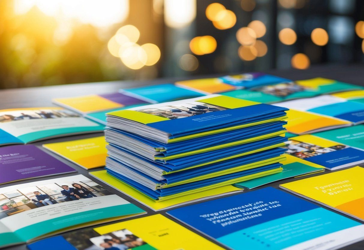
Fundamentals of Brochure Design
Brochure design requires careful attention to several key elements. The format, color choices, typography, and the layout all play important roles in making the brochure effective and appealing.
Choosing the Right Format
Choosing the right format is essential in brochure design. Common formats include bi-fold and tri-fold brochures.
- Bi-fold : Contains two panels, making it simple for readers to follow.
- Tri-fold : Has three panels, allowing for more content organization.
The choice depends on the amount of information and the intended audience. For example, a tri-fold is great for detailed presentations, while a bi-fold works well for clearer, concise messages.
Additionally, consider the brochure size and how it will be distributed. Portability is key for reaching a wider audience.
Color Palette and Typography
The color palette sets the mood and influences how the brochure is perceived. Choose colors that align with the brand’s identity.
- Bold colors : Grab attention and create excitement.
- Soft colors : Provide a calming effect and can convey professionalism.
Typography is equally important. A readable font ensures the message is easily communicated.
- Headlines : Use larger, bolder fonts to draw attention.
- Body text : Should be clear and legible, typically between 10-12 points.
Aim for a balance between colors and fonts to maintain visual harmony.
Hierarchy and Readability
Establishing a clear hierarchy helps guide the reader through the content. The most important information should be emphasized first.
- Headings : Use larger or bolder fonts for headings.
- Subheadings : Slightly smaller than headings, providing more detail.
Ensure that the text has enough contrast against the background to enhance readability. Use white space effectively to avoid clutter.
Short paragraphs and bullet points can also help convey information without overwhelming the reader. This structured approach keeps the focus on the key messages.
Crafting Compelling Content
Creating strong content is key to making brochures that attract attention. This includes using persuasive language and adding real-life examples. These elements help readers connect with the message and encourage them to take action.
Writing Persuasive Language
Persuasive language is vital for making content that grabs attention. This involves using words that spark interest and encourage action. For example, words like “discover,” “unlock,” and “transform” can make a message more appealing.
Using clear calls to action is important. Phrases such as “Get your free quote now!” or “Join our community today!” can guide the reader on what to do next.
Short sentences and simple words enhance understanding. Bullet points can also break up text and highlight key benefits, making it easier for readers to remember.
Incorporating Testimonials and Case Studies
Adding testimonials and case studies builds trust with potential customers. Real stories from satisfied clients show how a product or service has helped others. This provides proof of its effectiveness.
A well-placed testimonial might say, “This product changed my life!” with a name and photo for authenticity. Case studies can describe a problem, solution, and outcome, showcasing success.
Keeping these sections clear and to the point is crucial. Use headings and bullet points to make them easy to read. This not only captures attention but also supports the overall message of the brochure.
Visual Elements That Attract Attention
Effective brochures grab attention with strong visual elements. These elements include high-quality images , engaging infographics, and thoughtful use of color. Each part plays a role in creating visual interest and encouraging readers to engage with the content.
Selecting Quality Images and Graphics
Quality images are crucial for catching the eye. High-resolution photos provide a professional look and hold attention better than low-quality stock photos. They help convey messages clearly and can evoke emotions related to the content.
Using images that are relevant to the message also enhances connection. For example, if promoting a travel service, images of beautiful destinations invite interest.
It’s also beneficial to use original images when possible. This adds uniqueness and authenticity.
Incorporating Infographics and Icons
Infographics can simplify complex information and make it visually appealing. They combine data and images to tell a story or explain ideas quickly. Properly designed infographics can significantly boost understanding and interest.
Icons also serve a purpose. Simple icons aid navigation and highlight key points. They break up text and provide visual stops for the reader.
When using both infographics and icons, consistency in style enhances the overall design.
Utilizing Color Psychology
Colors have a strong effect on emotions and perceptions. Understanding color psychology helps in selecting shades that align with the message.
For example, blue often conveys trust, while red can promote urgency.
Using vibrant colors can draw attention but should be balanced to avoid overwhelming the reader. Creating a color palette that matches the brand identity helps in maintaining consistency. It also reinforces the message, making it more memorable.
Brand Consistency and Identity
Creating brochures that reflect a brand’s identity is essential. A strong brand presence ensures that the brochures connect with the target audience and establish trust. This section explores how to effectively incorporate logos and branding and ensure alignment with other marketing materials.
Incorporating Your Logo and Branding
The logo is a crucial part of a brand’s identity. It should be placed prominently on the brochure. Positioning it at the front cover ensures maximum visibility. The design around the logo should reinforce brand colors and fonts.
Maintaining the same style across all brochures is important. This includes using consistent colors , typography, and imagery.
For example, if a brand uses a specific shade of blue, it should appear in the brochure.
Incorporating brand elements helps the audience recognize and remember the brand. Consistent logos and colors create a cohesive look that enhances credibility.
Ensuring Branding Aligns with Other Marketing Materials
All marketing materials should echo the same brand identity. This means brochures should match the look and feel of websites, social media, and advertisements.
Using unified fonts and colors helps keep everything tied together. A customer should feel the same vibe whether they are looking at a brochure or visiting the brand’s website.
Creating a brand guide can help maintain this consistency. It can include rules for logo usage, color palettes, and acceptable fonts. This resource aids in keeping every piece of marketing aligned.
When branding is consistent, it reinforces messaging and builds trust. Customers are more likely to engage with a brand they can recognize across different platforms.
Effective Calls to Action
Effective calls to action (CTAs) are essential for guiding the reader’s next steps. They should catch attention and encourage the audience to engage with the brochure’s content. Strategic placement and compelling wording are key elements to maximize impact.
Strategizing Placement and Wording
CTAs should be placed where readers are most likely to see them. This often includes the front cover, inside sections, and the back panel of the brochure.
Using clear and direct wording is important. Phrases like “Call Now,” “Visit Us,” or “Get Your Free Sample” can create urgency.
The CTA should stand out visually. Using bold text or a contrasting color can draw attention. It can also be helpful to use bullet points or icons next to the CTA.
This makes it easier for readers to notice and understand the action they’re encouraged to take.
Leveraging Offers and QR Codes
Including offers can make a CTA more compelling. Discounts, special promotions, or free trials can motivate readers to act quickly. Clearly stating the benefits of these offers helps to capture interest.
QR codes add a modern touch and offer instant access to online content. When readers scan the code, they can access special deals or more information.
It is important to place the QR code next to a clear instruction on what to do. For example, “Scan for 20% Off” gives a direct prompt.
Combining enticing offers with visual elements like QR codes enhances engagement and drives results.
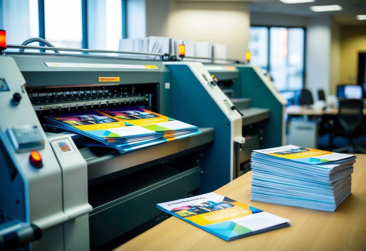
Printing and Production
Printing and production play a crucial role in the success of a brochure. Choosing the right paper stock and print quality can make a significant difference in the final product. This section looks at essential decisions about materials and printing options.
Selecting the Right Paper Stock and Print Quality
Choosing the right paper stock affects how a brochure feels and looks. Smooth, glossy paper can enhance images and colors, while matte paper offers a more sophisticated look.
Common paper weights include:
- 80 lb : Good for everyday brochures.
- 100 lb : Provides a more premium feel.
- Cover stock : Thick and sturdy, ideal for covers.
Print quality is just as important. It reflects the professionalism of the business.
High-resolution images and sharp text are vital. A standard print quality of 300 DPI is recommended to ensure clear visuals.
Professional Printing vs. In-House
When deciding between professional printing and in-house options, cost and quality should be considered.
Professional printing often provides:
- Expertise in color matching and finishing.
- Access to specialized materials.
- Higher volume printing capabilities.
On the other hand, in-house printing can save money for smaller batches. It offers quick turnarounds and convenience. But, it may lack the quality and options of professional services.
Distributing Your Brochure
Effective brochure distribution can amplify its reach as a marketing tool. Companies need to choose the right channels and combine traditional methods with digital strategies to maximize impact.
Choosing Distribution Channels
Selecting the right channels is vital for reaching the target audience.
Businesses can consider options like:
- Events and Trade Shows : Hand out brochures directly to potential customers. This face-to-face interaction can create a lasting impression.
- Local Businesses : Partner with local shops or cafes. Placing brochures in these locations can help attract customers who frequent those areas.
- Direct Mail : Sending brochures via mail allows for a targeted approach. It can reach specific demographics based on customer data.
- Community Boards : Posting on local community boards can spread awareness in targeted neighborhoods.
Integrating with Digital Advertising and Social Media
Combining brochures with digital advertising and social media can enhance visibility. Companies can:
- Share Digital Versions : Create a PDF of the brochure to post on websites. This provides easy access and can be shared via email.
- Promote on Social Media : Use platforms like Facebook and Instagram to showcase the brochure. Engaging posts can drive traffic and interest.
- Run Targeted Ads : Companies can use online ads featuring the brochure. This helps reach specific audiences based on their interests and online behavior.
Evaluating Brochure Performance
Measuring how well a brochure performs is crucial for making it more effective. Collecting feedback and analyzing data can help identify strengths and areas for improvement. This information guides future design choices.
Collecting Feedback and Analytics
Getting feedback is key to evaluating brochure performance.
Surveys can ask customers what they think about the design and content. Questions might include:
- What caught your attention?
- What information was missing?
- Were you inspired to take action?
Using online tools can track how many people view or download the brochure.
Engagement metrics show how effectively the brochure connects with customers. Combining qualitative and quantitative data provides a clear picture of its impact.
Iterating Designs Based on Performance
Using feedback to revise the brochure leads to better design.
If many customers say a certain image is appealing, it can be emphasized more. Data might suggest that a specific message drives higher engagement, which can be tested further.
A/B testing lets designers compare different versions of the brochure. By changing elements like headlines or colors, it is possible to find which design gets better results.
Regular updates based on feedback keep the content fresh and engaging, helping to maintain customer interest.
Final Review and Edit
A thorough final review and edit can greatly enhance the quality of a brochure. This step ensures that the information is accurate and that the design choices effectively communicate the message.
Proofreading for Errors
Proofreading is a critical step in the design process. It involves checking for spelling mistakes, grammar issues, and factual inaccuracies.
Here are some key tips for effective proofreading:
- Read Aloud : Hearing the text can help catch errors that may not be obvious when reading silently.
- Check Contact Information : Ensure that names, phone numbers, and email addresses are accurate and current.
- Use Tools : Utilize proofreading software or apps to help identify mistakes.
Making Last-Minute Adjustments
Making last-minute adjustments can improve the brochure’s appeal and effectiveness.
After proofreading, it’s crucial to consider the layout and design elements.
Here are some aspects to focus on:
- Visual Consistency : Verify that fonts, colors, and images are consistent throughout the brochure. This creates a professional look.
- Clear Call to Action : Ensure the call to action stands out. It should guide readers on what to do next.
- White Space : Adjust margins and spacing to provide enough white space. This makes the brochure easy to read and visually appealing.
Frequently Asked Questions
Brochure design has specific elements and techniques that can elevate its effectiveness. The following questions focus on essential design aspects, content organization, font and color strategies, visual enhancements, and print quality.
What are the key elements of a highly effective brochure design?
An effective brochure includes a clear message, an appealing layout, and eye-catching visuals. Headlines should grab attention and convey the main idea quickly. Contact information should be easy to find, and calls to action should prompt the reader to take the next step.
What techniques can be employed to make a brochure stand out to the audience?
To stand out, brochures should utilize bold colors, interesting shapes, and unique finishes. Adding features like die cuts or embossing can create tactile interest. Including high-quality images and compelling headlines will attract attention and encourage readers to engage with the content.
What are the best practices for organizing content within a brochure to maximize impact?
Organizing content logically is crucial. Start with a strong lead, followed by key benefits and persuasive details. Use bullet points and subheadings to break up text. This structure makes information easier to scan and helps keep the reader engaged.
What are some proven strategies for pairing fonts and colors in brochure design?
Pairing fonts and colors requires balance. Choose a clean font for body text and a bolder one for headings. Limit the color palette to two or three main colors to maintain harmony. Ensure there is enough contrast between text and background for readability.
How can visuals and graphics be utilized to enhance the appeal of a brochure?
Visuals should support the message and draw interest. High-quality images, infographics, and charts can illustrate points effectively. Consistency in style and color among graphics helps to create a cohesive look that strengthens the overall design.
What steps should be taken to ensure the print quality of brochures enhances the design?
To enhance print quality, use high-resolution images (300 DPI or higher) to avoid blurriness.
Choosing the right paper stock will also make a difference; options range from glossy to matte.
A professional printing service ensures that colors are vibrant and details are sharp, delivering a polished final product.…